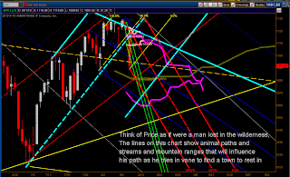
So now the next question should be
"How can I determine which lines will our man in the wilderness will choose to be influenced by?"
I use momentum and stochastic indicators along with Fibonacci Ratios.
Let's look at Fibonacci and how it relates to the market
This is called a Fractal because the pattern can be seen as a replication of the origin. Fibonacci Ratios fit within larger ratios and as you can probably see there is a correlation between Price and these ratios. Now I say probably because I have known people who say they don't see the relationship. If you are one of these people my analysis technique is not for you.
Here is an example of Fibonacci Fans.
They are useful with Fibonacci Ratios and
I like to let them guide me when drawing Andrews Pitchforks.
The Andrews Pitchforks allow me to know the limits
of market movement through time and when the trend has changed.
Price can be expected to travel withing the two outside "tines". When I draw a fork I use the center line "handle" and look for a symmetrical pattern within the fork. This technique allows me to forecast the anticipated range of the trend.
OK the market has closed, let's see how well the Andrews Pitchfork did at predicting the limits of the trend.
Tomorrow will either continue in the lower section or if it should pass to the opposite side of the handle then we will expect Price to find the top tine of the fork. At that point the market would be sold as Price can then be expected to return to the handle. Symmetry in the forks can generally be relied on so it would be expected that price will continue down between the top tine and the handle.
Should price break out of the limits drawn, then you know the trend has changed, or you need to reevaluate the points initially used in placing the fork.
I recommend experimenting with Andrews Pitchforks
in order to learn how to recognize and anticipate the fractal nature of the Andrews Pitchforks.
The wilderness chart at the top has other lines known as the Ichimoku Kinko Hyo, generally referred to as the Ichimoku. The loose translation from Japanese is "Market at a glance".
I will not go into a deep description of the Ichimoku here. I recommend referencing the link above to learn more. This system which can be used in any time frame will show the markets support, resistance and momentum. The Kumos "clouds" are of great importance and as you can see, Price may stray but the Kumo will always lure Price back.
In the example above, the Tenkan-sen is red, the Kijun-sen green and the Chikou-Span is gray.
The Kumos are those things that look like clouds. You may be noticing that while there are plenty of times Price seems to respect the lines plotted by the Ichimoku, there are also plenty of times when it has not regard for them at all. This system is a map of support and resistance and not a dictator of Price. Use it in various time frames and take it's advice as it is intended. In the wilderness chart at the top you can see how I draw the Kumos from other time frames. There is a lot of information that can be gathered quickly from the Ichimoku once you understand what to look for. I'll leave it up to you to learn more.
Indicators are an interesting area of analysis. I have spent thousands of hours manipulating formulas and watching the market for insight to what makes a good indicator. I have written several indicators that are mine alone. I began with a generous attitude and wanted to share everything I wrote. The lack of interest amazed me. Eventually I recognized the importance of what I was doing and have decided not too release the studies that make my Blog different than all the rest.
But I continue to share variations of the commonly known studies, and I am willing to write ThinkScript studies for free when I receive a request. Of course I still use Stochastic, MACD, Awesome Oscillator, PPS, Pivot Points and others to help guild me through the wilderness.
The new catch phrase for standard definition charts based on Bollinger Bands with a shorter period and narrower factor of deviation is MOBO which stands for Momentum Break Out. By plotting an oscillator across the average standard deviation band the markets momentum can be seen.
The use of Standard Deviation is important to many of the indicators I write. The basic principal is that the market can be expected to move within a certain amount of deviation. Moving beyond the standard deviation shows a market with a lot of momentum, but generally there is only so much force available, and when it passes to the opposite side of the expected deviation a signal is set up when that opposite limit is exceeded.
The fractal nature of the market is to swing from one extreme to the next, always finding it's way back. In doing so similar patterns will be generated that relate to each other through symmetry and Fibonacci ratios. The tools described here are intended to help us see the symmetry of those fractals.
This Blog has only informational, and educational purpose, and does not represent a proposal for buying or selling contracts, equities or currency.


No comments:
Post a Comment